Closed
Description
If there are multiple paths in a single trace (separated by null(s)), it could be useful to have a different stroke-width for each path. This way, I could solve this issue, without having to draw a separate trace for each line.
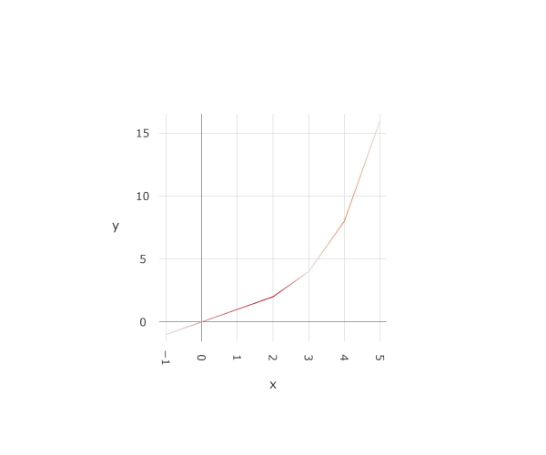
Minimal example here -- http://codepen.io/cpsievert/pen/wMzdME
Metadata
Metadata
Assignees
Labels
No labels
Type
Projects
Relationships
Development
No branches or pull requests
Activity
etpinard commentedon Dec 29, 2015
@cpsievert I'm not 100% convinced this is worth implementing.
I think adding colorscale functionality to lines would make more sense.
How does R handle this?
etpinard commentedon Dec 29, 2015
Ooops, my bad, I thought this issue was asking for
line.colorarray support.@cpsievert splitting trace data aroung
nullseems a bit magical to me. If other libraries do it, it might be enough to convince me though.cpsievert commentedon Dec 29, 2015
I agree, and would be happy to open another issue for that, if you like :)
In the ggplot2 translator, we translate ggplot2 "groups" (which are sort like traces, but share visual characteristics, and don't require a legend) using this
nullmagic since it is more efficient. I was thinking, with this array support, we could translate ggplot2 "size" in similar way (see plotly/plotly.R#340), but after thinking more carefully, it's probably better to have a traces for each group/size/color so we can have better tooltip info for the more typical use cases -- http://docs.ggplot2.org/current/geom_line.htmletpinard commentedon Dec 29, 2015
@cpsievert keep the issue open. It's idea worth thinking about.
etpinard commentedon Jan 5, 2016
@cpsievert looks like plotly.js could use your suggestion
7b07a25#diff-07ad6761e23a0608bb5079b46cce8951R29
The more I think about, the more I like this idea.
cpsievert commentedon Mar 9, 2016
In addition to https://plot.ly/r/reference/#scatter-line-width accepting a data array, it'd also be useful to have https://plot.ly/r/reference/#scatter-line-color accept a data array, so I can convert a plot like this:
melvynator commentedon Dec 12, 2016
I did work on a network graph at the end of this notebook: http://nbviewer.jupyter.org/github/melvynator/DM_FinalProject/blob/master/data_exploration/.ipynb_checkpoints/data_exploration-checkpoint.ipynb
But the problem is I tried to change the size of the edge between two nodes given the value in the similarity matrix but I didn't succeed it. I think my problem and this issue are linked.
FilipMiscevic commentedon Mar 25, 2017
I'm also trying to visualize networks and having variable line width for each edge would be desirable. Having each individual edge as a trace and setting its width independently works, but is slow in loading and not as responsive when compared to a single trace for each edge (e.g. 200 vs 1 traces). Here's an example: https://plot.ly/~fmiscevi/3/
The loading issue is so significant that the Plotly Powerpoint addin can't display these graphs... I can't be sure but it seems like it just times out while loading. I get the error "Sorry, we had to restart [the add-in] because this add-in wasn't responding."
edward-wilson commentedon Apr 2, 2017
Adding my support for this request - I am trying to do the same thing (variable Line width) using the plotly for R package. I have multiple paths in my data, separated by NAs to build (financial candlestick data), for which I'm trying to implement dynamic widths based on the volume in that bar (processed into Low, Medium, High categories). A variable color array option would also be great. For now, I'm going to create separate traces as suggested by cpsievert, as I only have 3 different width/color categories. However, this would become an issue if you had more potential width options. Also, it's not great should I wish to change the categories.
rreusser commentedon Apr 2, 2017
How would per-segment properties be represented? Is there precedent? Would you say:
Would the first segment get a width of 2 (the first in the segment)? 3 (the average)?
For anyone waiting on this feature, I made a quick codepen illustrating a way to fake it using fills: http://codepen.io/rsreusser/pen/zZepdO?editors=0010
To summarize, it just draws f(x) + width(x) from 0 to 1 and then walks back from 1 to 0 with f(x) - width(x) and draws it as a fill (i.e no lines).
[-]Support for line width array?[/-][+]Support for line width/color array?[/+]19 remaining items
akhmerov commentedon Aug 7, 2018
@alexcjohnson you are absolutely right, thanks.
fromtotrace type proposal #2876asherp commentedon Sep 4, 2020
A workaround I've found is that graph_objs.Line actually accepts an array of colors. You'll get a deprecation warning that you'll have to ignore.
Btw, another application is visualizing field lines in a magnetic field simulation, which we do all the time in space weather. Colors can be used to distinguish between different types of topology or to look at other parameters that may vary along a field line (temperature, curvature, etc). Often these plots contain hundreds of field lines, and the overhead for storing them as separate traces is unfeasible.
jackparmer commentedon Sep 10, 2020
This issue has been tagged with
NEEDS SPON$ORA community PR for this feature would certainly be welcome, but our experience is deeper features like this are difficult to complete without the Plotly maintainers leading the effort.
Sponsorship range: $10k-$15k
What Sponsorship includes:
Please include the link to this issue when contacting us to discuss.
atomsk121 commentedon Oct 8, 2020
Another use for this feature is with large datasets.
Adding ~1000 traces made up of 4097 points takes way too long, because the time it takes to add trace goes up as a function of how many traces were already added.
Adding one trace with gaps is much much faster, but there is no way to differentiate between the lines.
Erhannis commentedon Dec 1, 2020
Is there a reason this feature is difficult to implement? Speaking specifically of color arrays, I notice that scatter3d accepts arrays for line.color - what makes scatter harder/different?
nicolaskruchten commentedon Dec 1, 2020
At the moment, I believe that for SVG-based traces (i.e.
scatter) the line is a single SVG path, but for WebGL-based traces (i.e.scatter3d) each line segment is drawn separately, which is one reason why this is harder to implement forscatter.Erhannis commentedon Dec 2, 2020
Hmm. Is there a clear thing-to-do, it's just hard or time consuming? Or is it a problem with no clear solution? For instance, from your description it sounds like the thing-to-do would be to alter the SVG code to make multiple paths when there are multiple colors. Is that highly inefficient or something?
nicolaskruchten commentedon Dec 2, 2020
There's a mix of both: it's a big change to our codebase, and it's probably a lot less efficient than the current approach, so might require a lot of optimization work in order not to introduce performance regressions.
Erhannis commentedon Dec 3, 2020
Hmm. Could you rejigger the webgl code to do it, as a stopgap measure? In the meantime, I've found a vaguely acceptable workaround: aligning a
scatter3dplot to look like a 2d plot.Do you notice any problems with it? (Aside from that you can't change the viewpoint, and the hover-over shows an extraneous "z" coord.) Also, is there a way to zoom in a bit, programmatically? I didn't find any clear params for it in the docs. The above solution leaves a pretty thick margin around my plots, as shown below:
but, if I zoom in with the mouse a bit, it fits much better.
gvwilson commentedon Jun 5, 2024
Hi - this issue has been sitting for a while, so as part of our effort to tidy up our public repositories I'm going to close it. If it's still a concern, we'd be grateful if you could open a new issue (with a short reproducible example if appropriate) so that we can add it to our stack. Cheers - @gvwilson